Building a Silky-Smooth iOS Progress-Bar Unlock Interaction
This article breaks down the animation behind the hidden easter-egg entry point at the bottom of the KikoCard app. After I posted a clip of the interaction to the community, a lot of people said they were curious about how it worked — so here we are. I'll walk through the thinking and the mechanics, layer by layer, so you can understand exactly how this animation comes together. Beginners can follow the concepts; experienced developers can dig into the code.
I'll be as thorough as I can dissecting the KikoCard easter-egg implementation, making sure everyone can understand and reproduce every step. The animation is built entirely in SwiftUI — which shows off just how capable and flexible that framework can be. I'll include the essential code snippets throughout; feel free to read them closely or skim past.
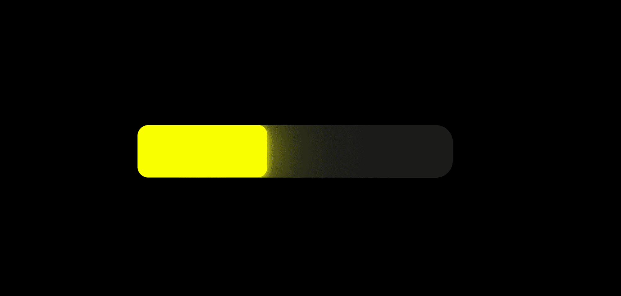
Gradient Glow
The most critical visual piece of this whole animation is the gradient glow. The key detail is simulating the way a physical point light source spreads and decays — mimicking what real light actually does. On top of that, a mask layer clips the glow at the edges so it doesn't bleed out beyond the bounds of the element.
Physics
By stacking multiple layers of progressively fading shadows, you can achieve a softer, more physically convincing scattered-light effect. It's like watching light leave its source: the edges gradually soften and the glow fans out, giving the whole thing a very natural, real-world feel.
In practice, stacking three or more shadow layers gets you there. There's no strict formula for the opacity, spread size, or shadow values — the goal is to approximate real-world physics as closely as possible. As a general rule: tighter layers get higher opacity; wider layers get lower opacity. This non-linear stacking produces a really satisfying result.
.shadow(color: .accent.opacity(0.3), radius: 80)
.shadow(color: .accent.opacity(0.5), radius: 60)
.shadow(color: .accent.opacity(0.6), radius: 20)
.shadow(color: .accent.opacity(0.7), radius: 8)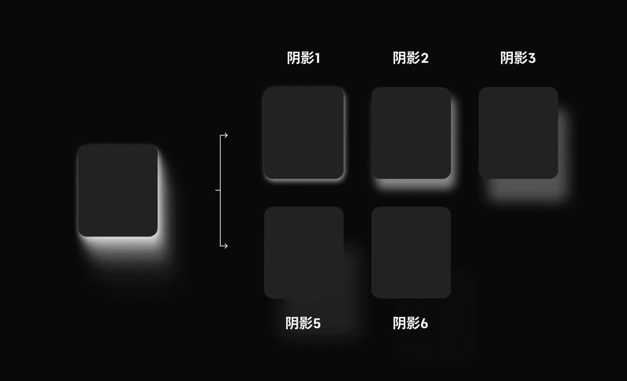
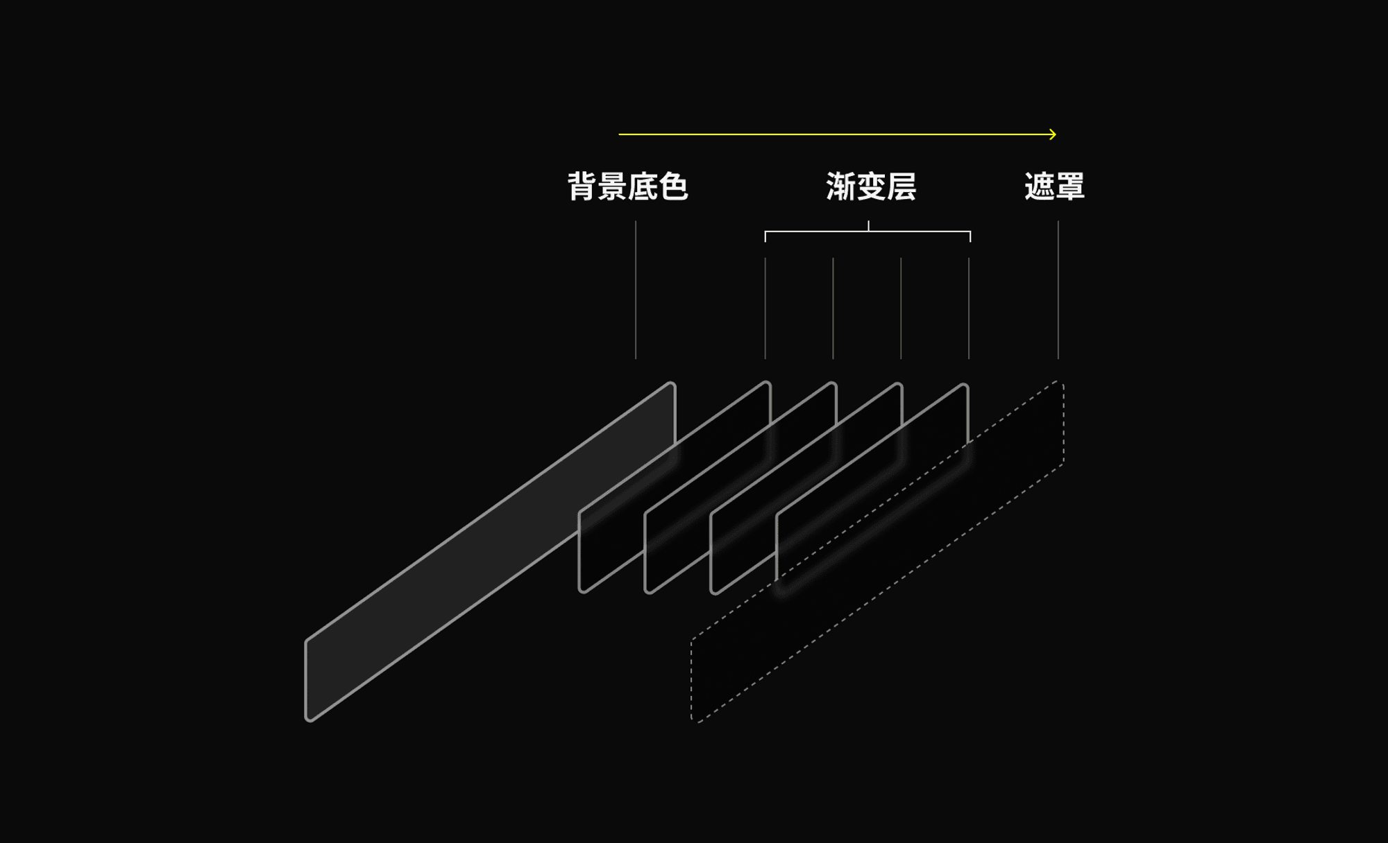
Mask
In SwiftUI, when you need to trim excess parts of a view, there's a simple approach: apply a rectangular mask. The mask clips away any glow that spills outside the intended area, keeping the design precise and intentional. Simple and highly effective.
.contentShape(Rectangle())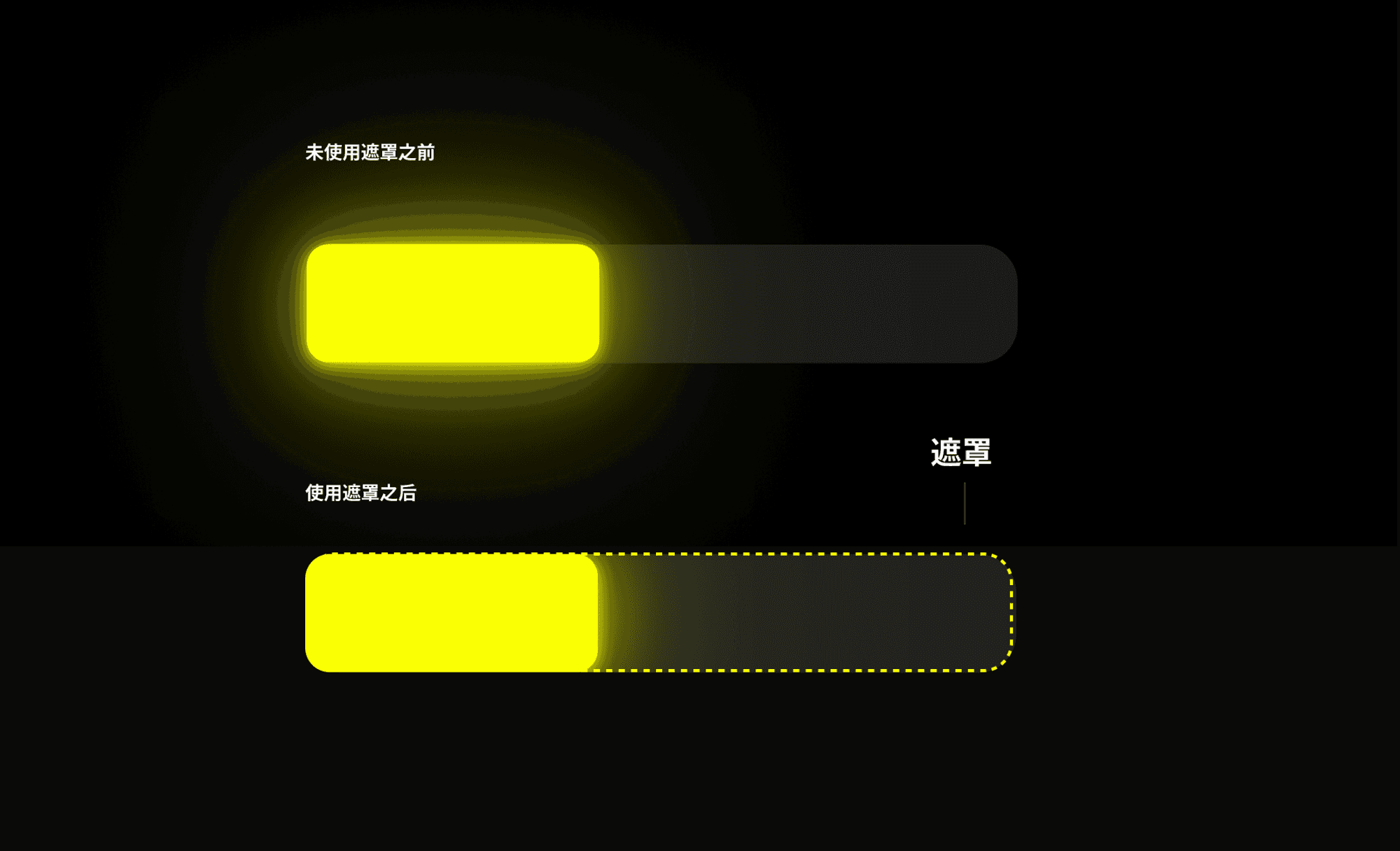
Implementing the Progress Bar
Percentage
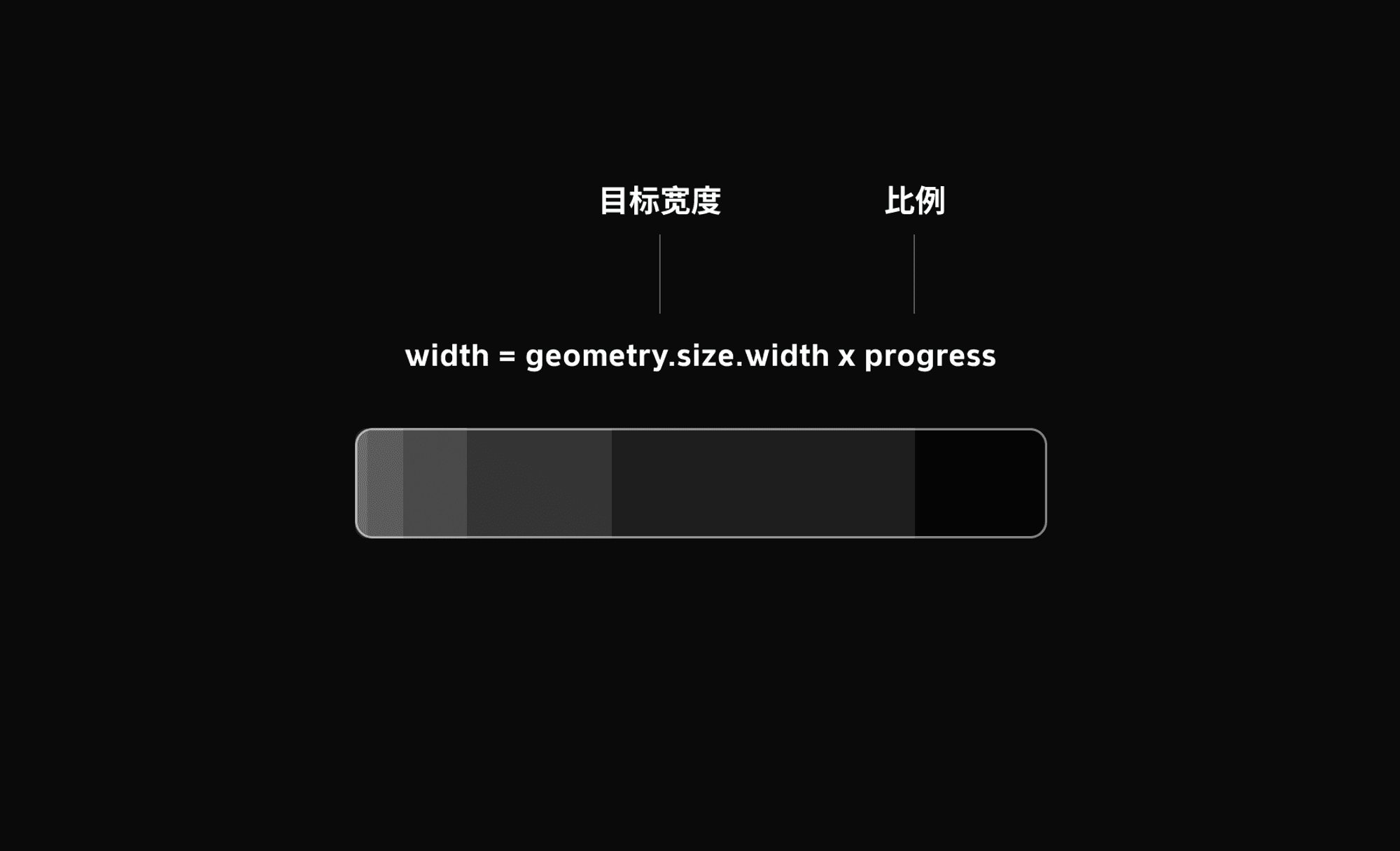
In SwiftUI, GeometryReader gives you access to the size and position of a view — it's an incredibly useful tool. We add a full-width modifier at the outermost layer so we can read the available width dynamically. The progress bar's width then adjusts based on whatever parameter we pass in, making it flexible and easy to work with.
Width Change
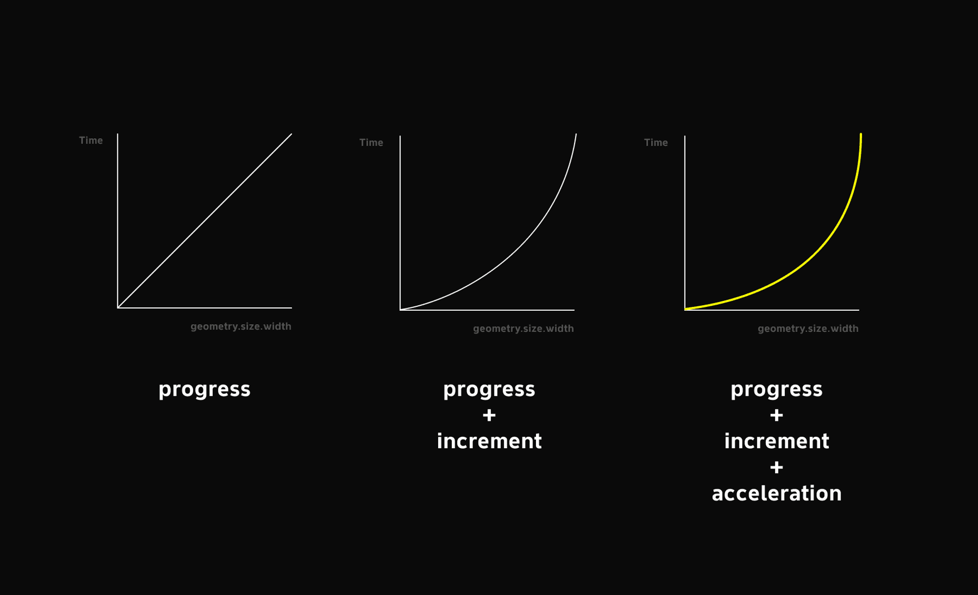
Here, progress is a percentage value representing how complete the fill is. For example, if we increment it by 0.01 every 0.01 seconds (that's 1% per tick), the bar takes exactly 1 second to go from 0% to 100%. This gives us control over the fill speed. However, a constant-rate progress bar produces a linear animation — and linear doesn't feel like charging up.
@State private var progress: CGFloat = 0
@State private var timer: Timer?
@State private var isProgressCompleted: Bool = false

var body: some View {
    GeometryReader { geometry in
        RoundedRectangle(cornerRadius: 12, style: .continuous)
            .frame(width: isProgressCompleted ? geometry.size.width : geometry.size.width * progress)
    }
    .frame(maxWidth: .infinity)
}
Charging Up
This method handles three things, all of which matter a lot to the feel of the interaction:
- Releasing snaps the bar back to zero — a physically grounded feedback that ensures the bar resets cleanly when you lift your finger, without interfering with anything else.
- Progressively increasing width increments — the bar fills gradually rather than jumping, which creates a much better sense of building tension.
- Escalating haptic pulses — haptic feedback fires alongside the widening bar, reinforcing the physical feel.
Acceleration
So how do we get a progress bar that accelerates — one that actually feels like you're charging up? The approach is straightforward: we set a constant acceleration of 0.00007. Each tick adds a slightly larger increment than the last, so growth is exponential rather than linear. In the first step, progress becomes 0.007% + 0.07% = 0.077%, so the bar moves very slowly at the start. As increments keep stacking up, the full bar fills in about 1.72 seconds.
As long as the bar hasn't hit 100%, isProgressCompleted stays false and resetProgress() is called to snap back to zero on release. The moment the bar hits 100%, isProgressCompleted flips to true, the loop ends, and the user sees the complete sequence play out.
Haptics
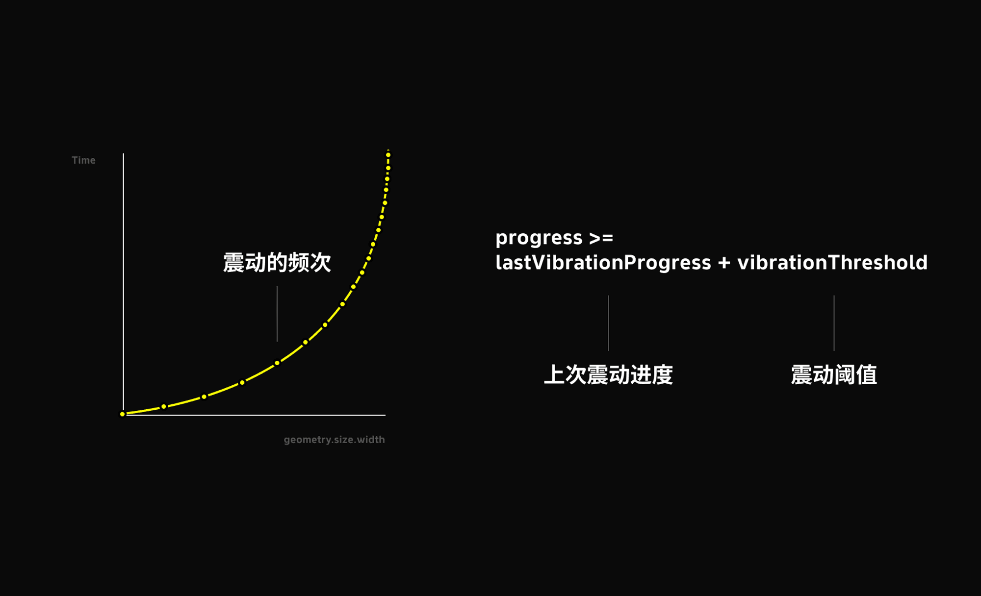
The haptic feedback is implemented through UIKit, which offers several intensity levels. I went with soft, a lighter option. The haptic logic mirrors the acceleration approach: it's incremental and tied to the bar's width. Once progress exceeds 0.1%, a haptic fires. Given that the first 10ms only advances progress by about 0.07%, the feedback starts sparse and builds to a rapid drumbeat — roughly 75 pulses by the time the bar completes. That rhythm really amps up the sense of tension.
One thing worth calling out: haptic frequency must not be too high. My original implementation fired a pulse on every width change — first problem, it would numb your hand; second problem, the haptic feedback itself started stuttering slightly. So I set a threshold to dial the frequency back to something that feels intentional rather than frantic.
func startProgress() {
    // Cancel any existing timer
    timer?.invalidate()
    isProgressCompleted = false // Reset completion state
    var increment = 0.0007 // Initial increment
    let acceleration = 0.00007 // Acceleration of the increment

    let feedbackGenerator = UIImpactFeedbackGenerator(style: .soft)
    feedbackGenerator.prepare()

    // Vibration threshold — fire once per 1% increase
    let vibrationThreshold: CGFloat = 0.01

    // Track progress at last vibration
    var lastVibrationProgress: CGFloat = 0

    // Create a new timer
    timer = Timer.scheduledTimer(withTimeInterval: 0.01, repeats: true) { [self] timer in
        // Update progress
        self.progress += increment

        // Increase increment to simulate acceleration
        increment += acceleration

        // Fire haptic when progress passes the threshold
        if self.progress >= lastVibrationProgress + vibrationThreshold {
            feedbackGenerator.impactOccurred()
            lastVibrationProgress = self.progress
        }

        // Cap progress at 1
        if self.progress >= 1 {
            timer.invalidate()
            self.progress = 1
            self.isProgressCompleted = true // Mark as complete
        }
    }
}

func resetProgress() {
    // Cancel timer and reset
    timer?.invalidate()
    progress = 0
    isProgressCompleted = false // Reset completion state
}
Long-Press Gesture
Gesture Sequences / Gesture Chains
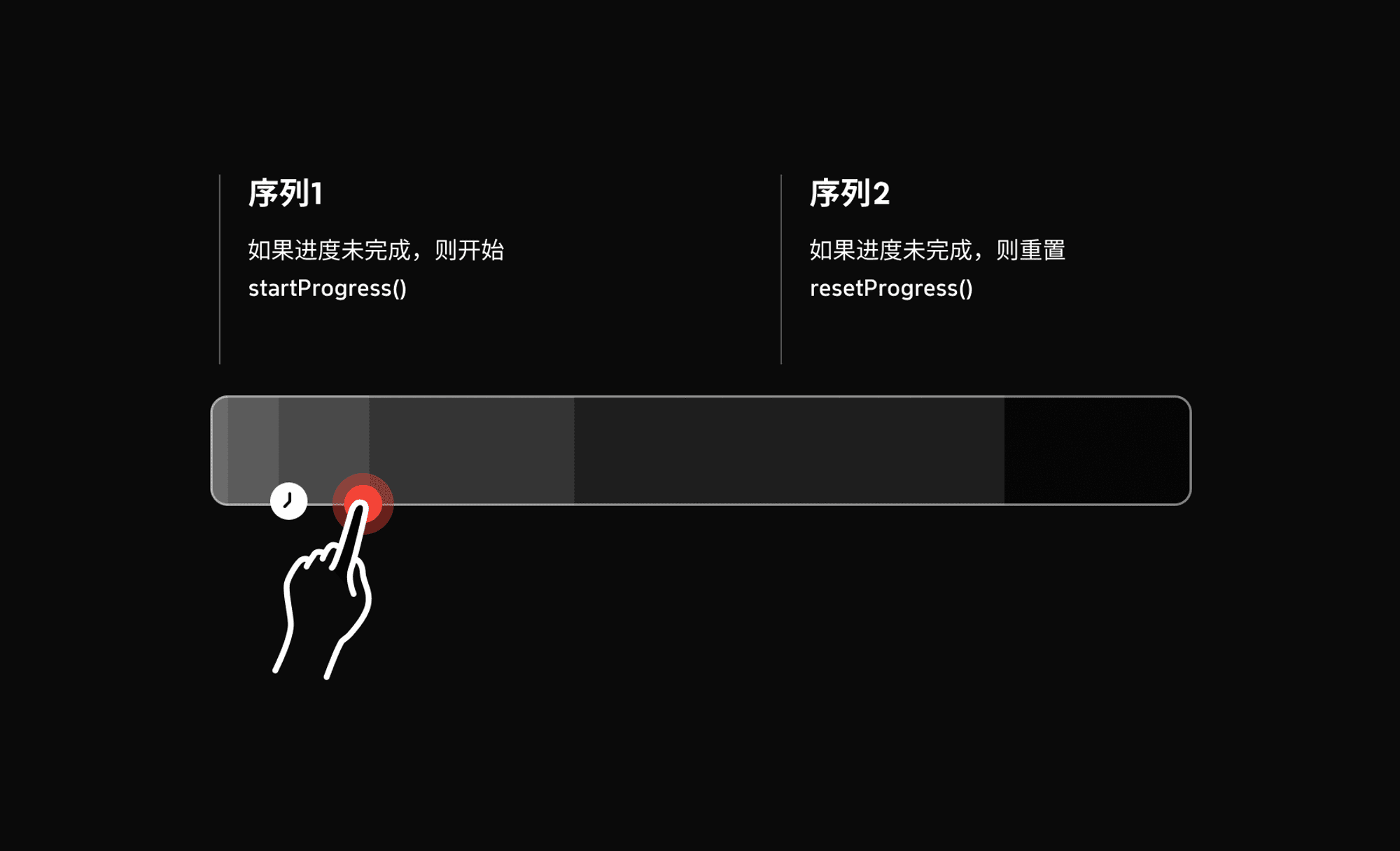
The start and reset methods need to be paired with gestures. I used sequenced to chain two actions: a long-press to begin charging, and a drag-release to reset if the bar hasn't completed. If you just stack gestures, they fire asynchronously with equal priority. Gestures, like layers, can be given an explicit ordering. The example below shows how to set up a synchronous sequence.
LongPressGesture(minimumDuration: 0.5)
    .onEnded { _ in
        withAnimation {
            if !isProgressCompleted { // Start if not yet complete
                startProgress()
            }
        }
    }
    .sequenced(before: DragGesture(minimumDistance: 0))
    .onEnded { _ in
        withAnimation {
            if !isProgressCompleted { // Reset if not yet complete
                resetProgress()
            } else {
            //
            }
        }
    }
Rectangle Scaling
Magic Move / matchedGeometryEffect
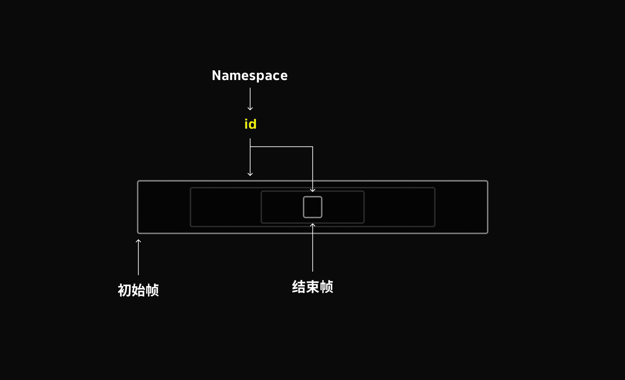
The rectangle scaling is powered by matchedGeometryEffect — a genuinely powerful modifier. In practice it's straightforward: it works similarly to the Magic Move transition in After Effects. You define the start frame and the end frame, and SwiftUI automatically generates all the frames in between. The result is a silky, natural-feeling transition.
To uniquely identify the two frames, SwiftUI provides the @Namespace property wrapper. Namespace stamps the start and end frames with a shared identity so the animation is wired up correctly. You can pair it with if/else to swap between elements — one disappears, another appears, and all the intermediate animation is filled in automatically.
@State private var scaleIntoOneCard = false // Collapse into one card
@Namespace private var shapeTransition // Geometry transition namespace

if !scaleIntoOneCard {
    progressbar()
        .matchedGeometryEffect(id: "card", in: shapeTransition)
} else{
    RoundedRectangle(cornerRadius: 4)
        .matchedGeometryEffect(id: "card", in: shapeTransition)
}
One Card Becomes Six
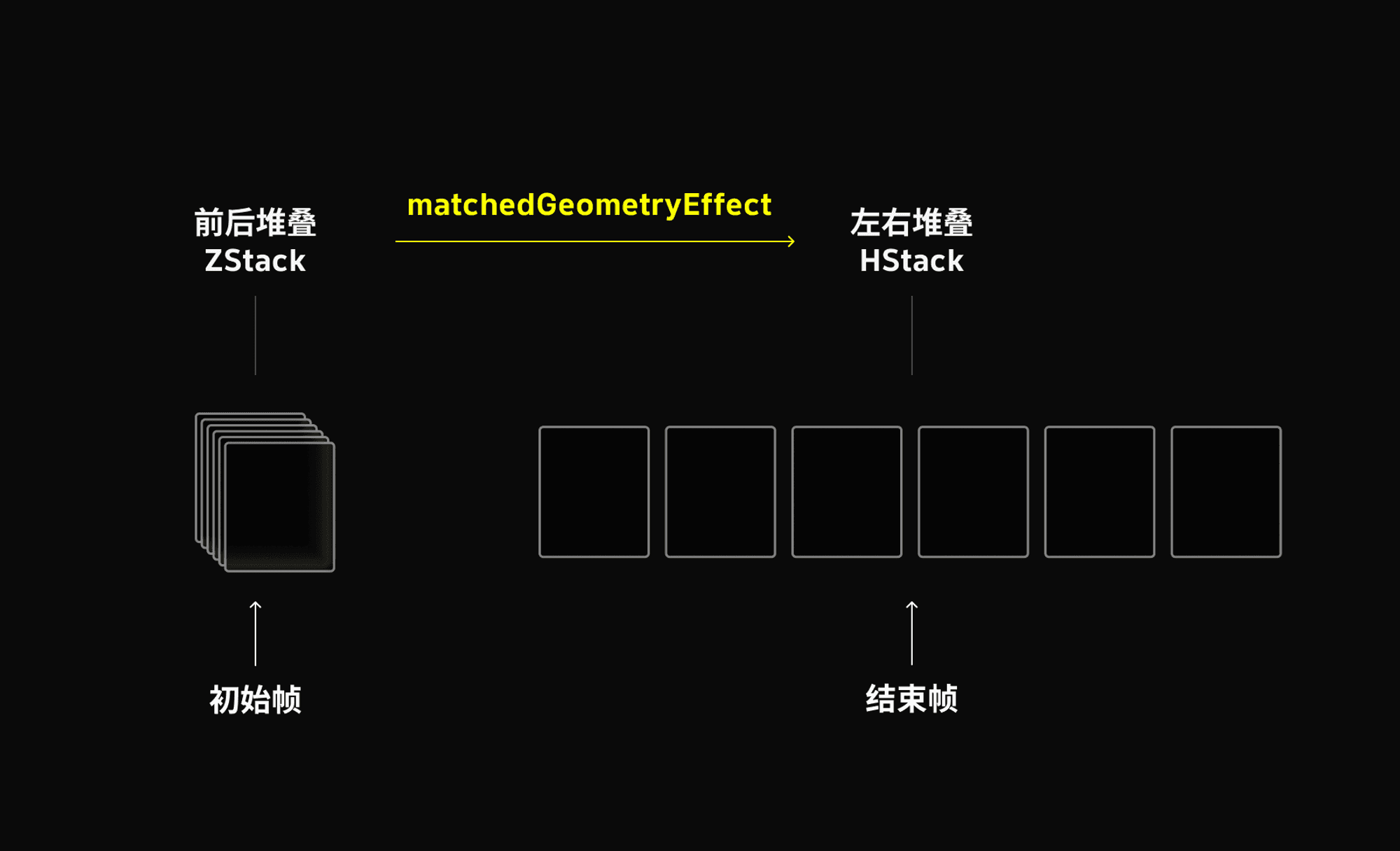
At the point described above, we have a single card that's served its purpose, so we let it disappear. But from the user's perspective, nothing looks hidden — 0.5 seconds before the card vanishes, we've already quietly stacked six cards behind it using ZStack.
The stacking logic is exactly the start-frame / end-frame pattern: one state uses ZStack (front-to-back stacking), the other uses HStack (side-by-side). All the transitions between them are handled by matchedGeometryEffect. Each card gets an index from 1 to 6, producing a clean visual cascade. The one thing to be meticulous about here: ids must correspond exactly between the two states, or the whole animation breaks down. This is the kind of detail that can quietly ruin everything if you miss it.
ZStack {
    ForEach(0 ..< 6) { index in
        card()
            .matchedGeometryEffect(id: "card\(index)", in: shapeTransition) // Animation tag
    }
}
HStack {
ForEach(0 ..< 6) { index in
card()
.matchedGeometryEffect(id: "card\(index)", in: shapeTransition)
}
}So the full sequence is: hold until the bar fills → collapse into one card → single card disappears → one card fans out into six → six cards disappear → password input appears. The overall transition effect is very much like Keynote's Magic Move.
Input Field
Monospaced Digits
A verification-code-style input can be built with six separate TextFields and FocusField to walk the focus from digit to digit — but I was lazy. The background cells are fake; I used a single full-width TextField.
The spacing effect is achieved by controlling character kerning. You must use a monospaced number font so every digit occupies exactly the same width and the spacing stays consistent.
.kerning(20)
.font(.system(size: 13).weight(.bold).monospaced())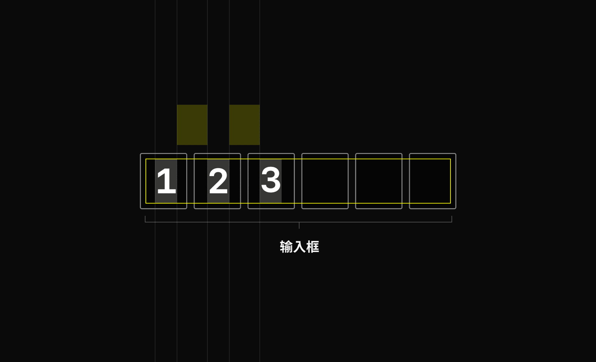
Shake
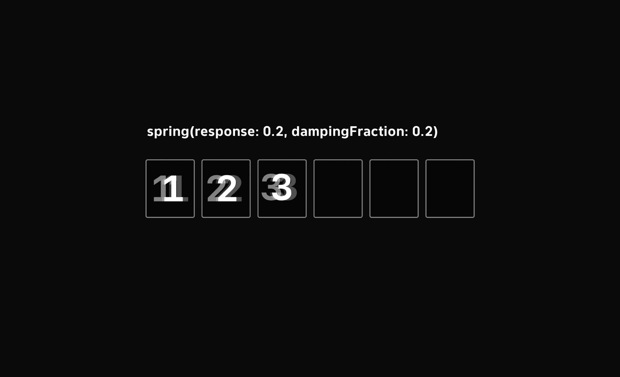
There's a shake animation for wrong-password feedback. I went the cheap way here too. The usual approach is a decreasing x-axis offset that oscillates left and right — instead, I applied a spring animation to the TextField: the field starts to shift 4 units along the x-axis, then gets abruptly stopped.
The spring has natural damping, so it takes a few more frames to settle back to zero. That settling motion is the shake. A neat trick that does the job without any manual oscillation math.
.offset(x: start ? 4 : 0)

//

start = true
withAnimation(Animation.spring(response: 0.2, dampingFraction: 0.2, blendDuration: 0)) {
    start = false
}
Dissolve Dismiss Transition
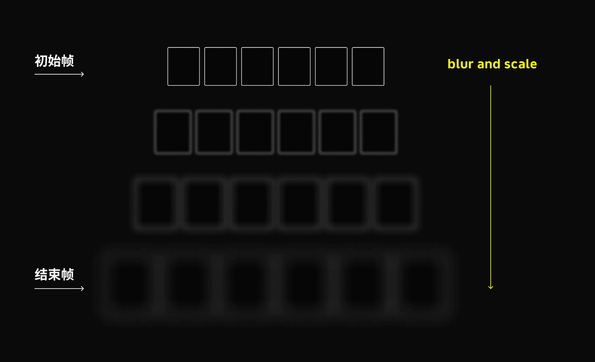
The success dismiss animation uses a custom composite transition that combines opacity and scale. This is the same kind of transition Apple loves to use — you can see it in Spotlight on iPad, for instance.
The concept is simple: the end frame is an enlarged, blurred version of the view. You control radius and scale to tune the intensity. Note that the right values are also influenced by the size of the element being dismissed.
private struct BlurModifier: ViewModifier {
    public let isIdentity: Bool
    public var intensity: CGFloat

    public func body(content: Content) -> some View {
        content
            .blur(radius: isIdentity ? intensity : 0)
            .opacity(isIdentity ? 0 : 1)
    }
}

public extension AnyTransition {
    static var blur: AnyTransition {
        .blur()
    }

    static var blurWithoutScale: AnyTransition {
        .modifier(
            active: BlurModifier(isIdentity: true, intensity: 5),
            identity: BlurModifier(isIdentity: false, intensity: 5)
        )
    }

    static func blur(
        intensity: CGFloat = 5,
        scale: CGFloat = 0.9,
        scaleAnimation animation: Animation = .spring()
    ) -> AnyTransition {
        .scale(scale: scale)
            .animation(animation)
            .combined(
                with: .modifier(
                    active: BlurModifier(isIdentity: true, intensity: intensity),
                    identity: BlurModifier(isIdentity: false, intensity: intensity)
                )
            )
    }
}
Animation Control
DispatchQueue.main.asyncAfter is a go-to method for delaying code execution on the main thread. It's ideal when you need something to happen slightly later without blocking the current flow — great for keeping the UI responsive or waiting for the right moment before triggering the next step. I especially like nesting these calls: kick off an action, then fire the next one 0.5s after it completes. No manual timing math required.
DispatchQueue.main.asyncAfter(deadline: .now() + 1) {
    withAnimation {
        showSixCards = true
    }
    // Show password input one second later
    DispatchQueue.main.asyncAfter(deadline: .now() + 1) {
        withAnimation {
            showPasswordInput = true
        }
    }
}
And that's a wrap. I'm glad to be able to share some of these design details with everyone. This article is an even split between design and engineering — and you'll probably notice something along the way: designers who can't code are constantly hitting walls; engineers who don't think in design terms often say "why bother, you can't even tell the difference." There's still a massive gap between the two worlds — the Mariana Trench. Modern specialization seems to push everyone toward one lane, but most of the work that actually matters is a continuous, multi-disciplinary thing. That's at least how I see it.
This was written a bit quickly — I tried to use diagrams as much as possible to get the concepts across. If anything is confusing or unclear, please feel free to reach out.